If we hadn’t distinguished the periods, we would have to conclude that there is no relationship between MR and CPI.
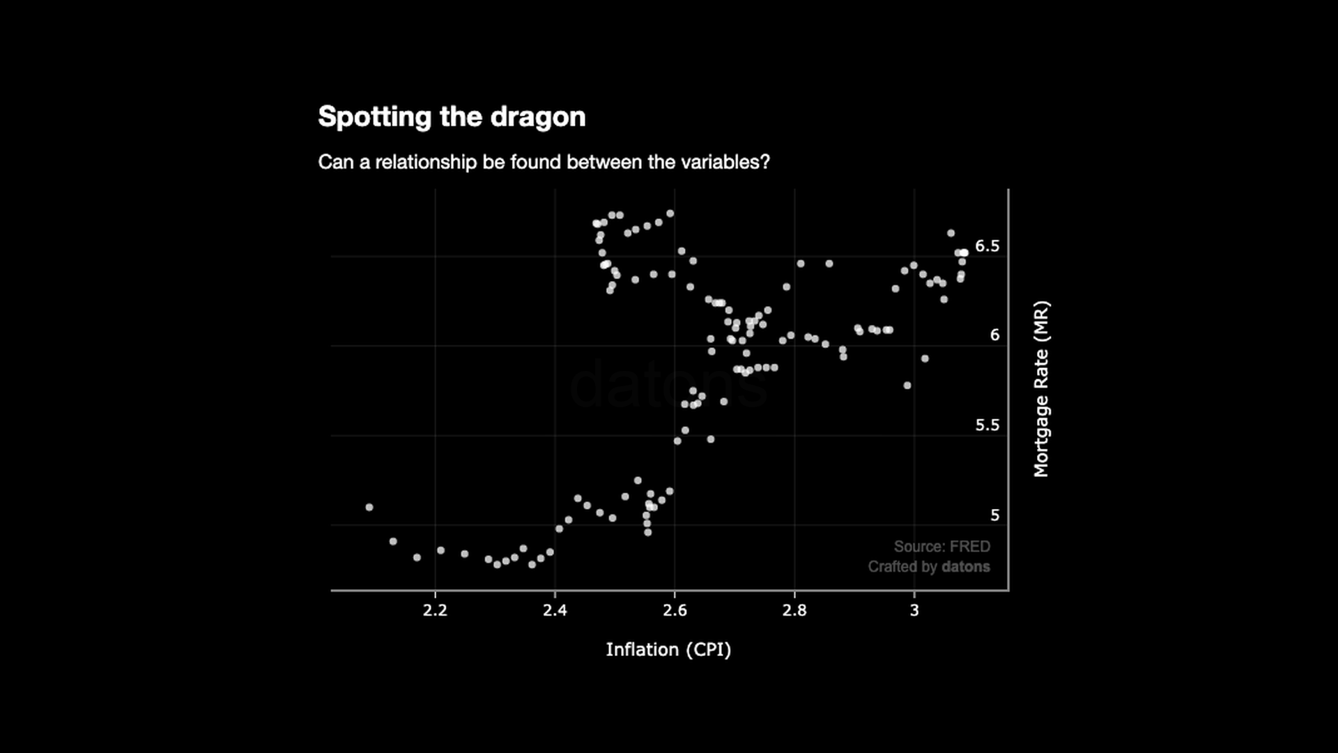
The relationship depicts a pattern more similar to a dragon than any kind of linear relationship.
However, creating a new feature is not the only transformation we have applied to the data.
Questions
- Why does resampling the time from weeks to months improve the correlation analysis?
- How much does the \(R^2\) score improve after adding the period feature?
- Why did the MR decrease when the CPI increased before the crisis?
Data
For each week between 2007-06-01 and
2009-06-01, we have the Consumer
Index Price (CPI), also known as the Inflation, and the Mortgage
Rates (MR).
Download the dataset and practice with this tutorial.
import pandas as pd

df = pd.read_excel('CPI_MR_2008.xlsx', index_col=0)
df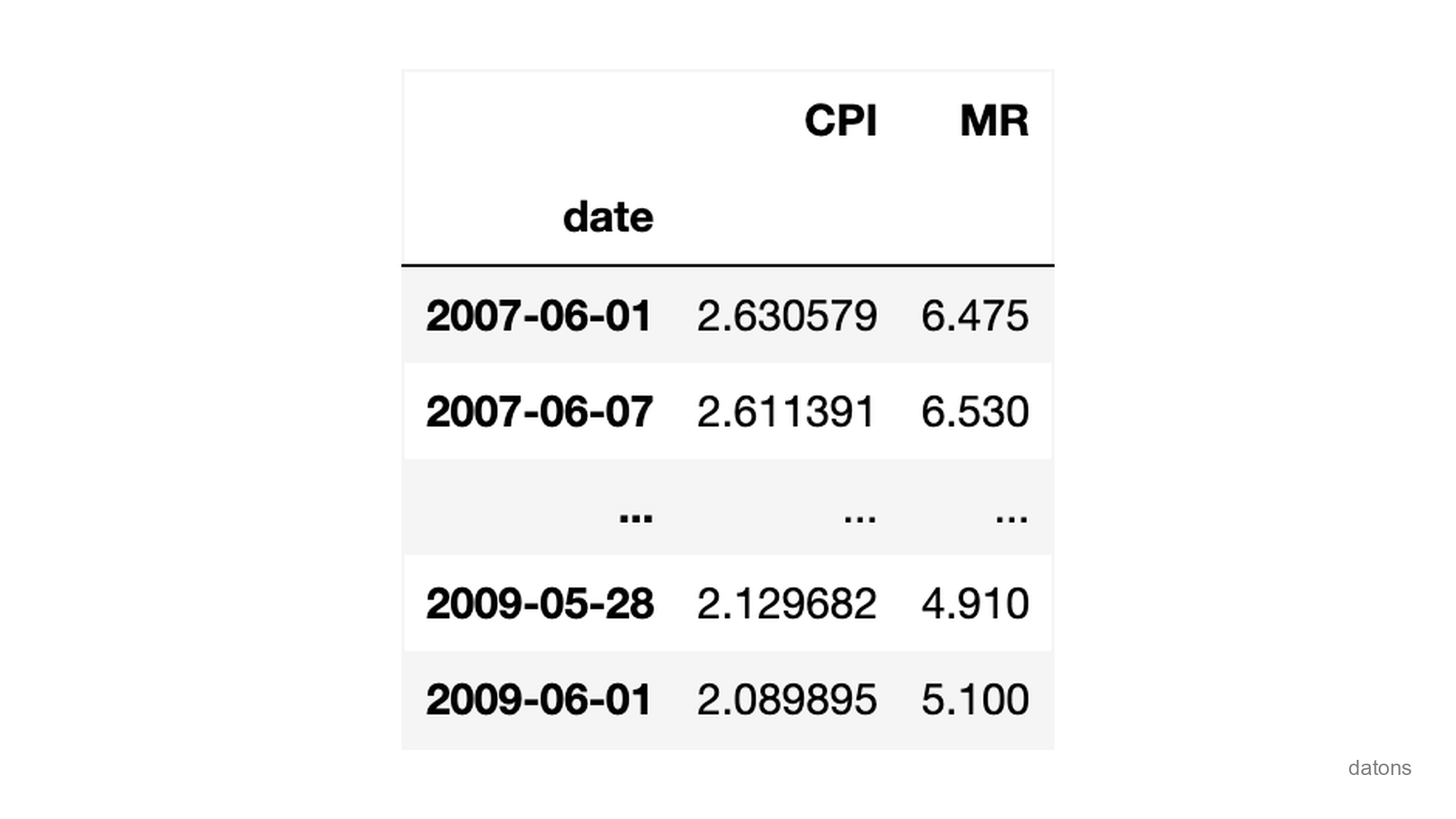
The goal is to measure the influence of the CPI on the MR.
In other words, how much will the MR increase if the CPI increases by 1%?
Analysis
Dummy Approach with Raw Data
Obviously, the line doesn’t fit the relationship:
import plotly.express as px

px.scatter(df, x="CPI", y="MR", trendline="ols")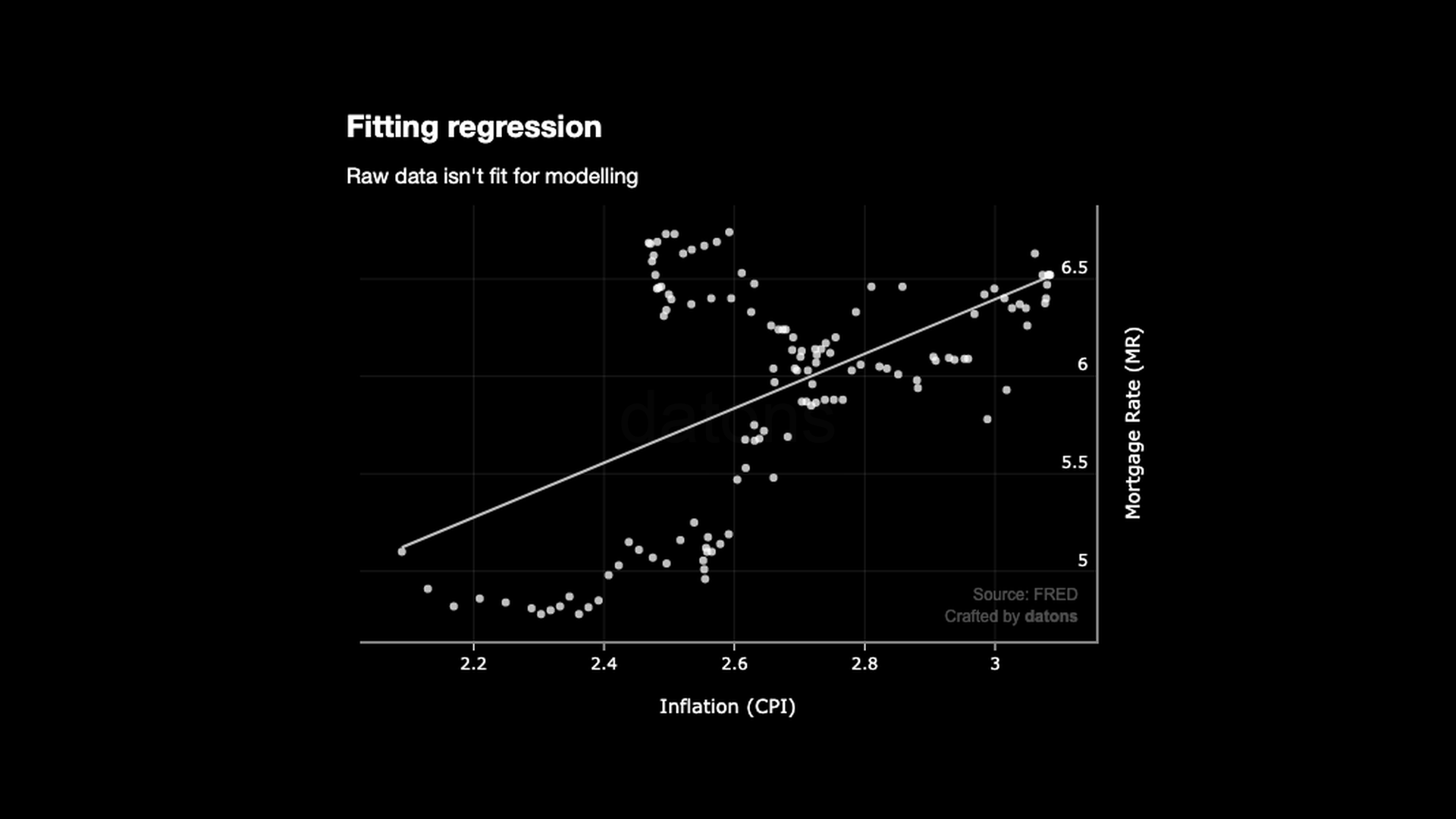
The \(R^2\) score is 0.287, which means that the model explains 28.7% of the MR variance.
One of the problems is that the data is too granular: one data point for every week, which causes noise for the model.
Resampling the Data into Smaller Periods
If we resample the data into months, the overall difference from the line to the data points (aka the residuals) is smaller. Hence, the \(R^2\) score is higher: 0.338.
df = df.resample('M').mean()
px.scatter(df, x="CPI", y="MR", trendline="ols")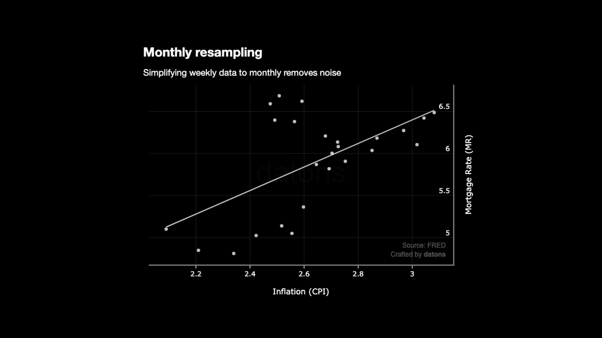
Yet, the relationship is still not linear because the data points are not aligned with the line.
What else can we do?
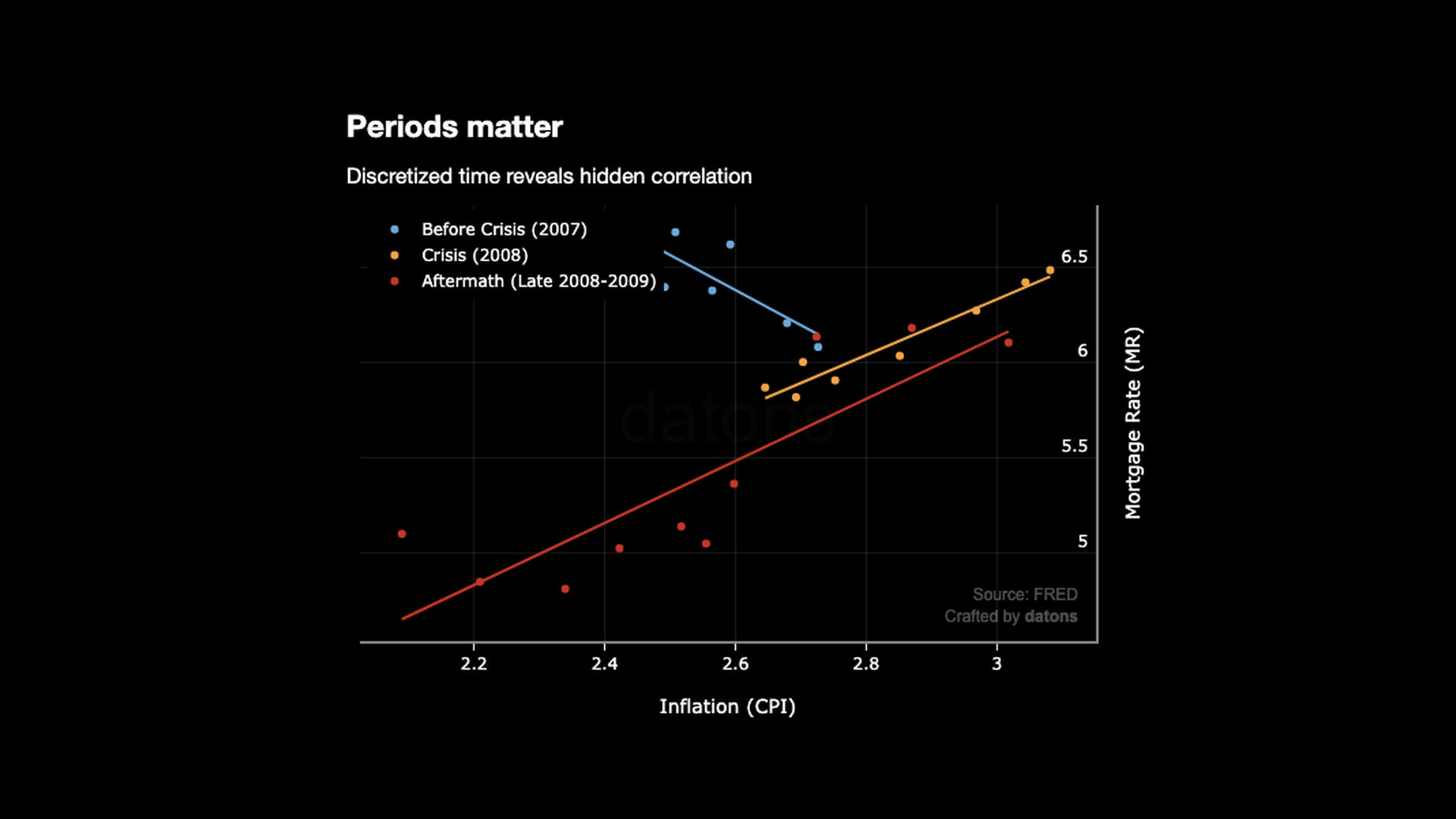
Discretizing the Data into Periods
The 2008 financial crisis had 3 periods.
Therefore, if we create a new feature (columns) to distinguish them, the relationship becomes linear for each.
dates = ['2007-06-01', '2008-01-01', '2008-09-01', '2010-01-01']
dates = pd.to_datetime(dates)

periods = pd.cut(df.index, bins=dates,
    labels=['Before', 'During', 'After'], right=False)

df['Period'] = periods

px.scatter(df, x="CPI", y="MR",
    trendline="ols", color='Period')
Now that the data points are aligned:
- How much does the \(R^2\) score improve?
- For each 1% increase in CPI, how much does the MR increase?
Interpreting the OLS Regression Results
In the latest model we computed, the \(R^2\) score was 0.338. After adding the period feature, the \(R^2\) varies between 0.625 and 0.935, among the 3 phases.
It’s curious that before the crisis (2007), for each 1% increase in CPI, the MR decreases by 1.84%.
Theoretically, the CPI should increase the MR because central banks increase the interest rates to control inflation. Therefore, the MR should increase as well.
However, global financial imbalances and aggressive lending practices during a booming housing market, made the MR decrease.
Once the crisis started, the CPI and the MR started to increase together.
df_result = (px
 .get_trendline_results(fig)
 .set_index('Period')
 )

for period, row in df_result.iterrows():
    result = row['px_fit_results']
    summary = result.summary(
        yname='Mortgage Rate',
        xname=['Intercept', 'Inflation'],
        slim=True
    )

    print(summary)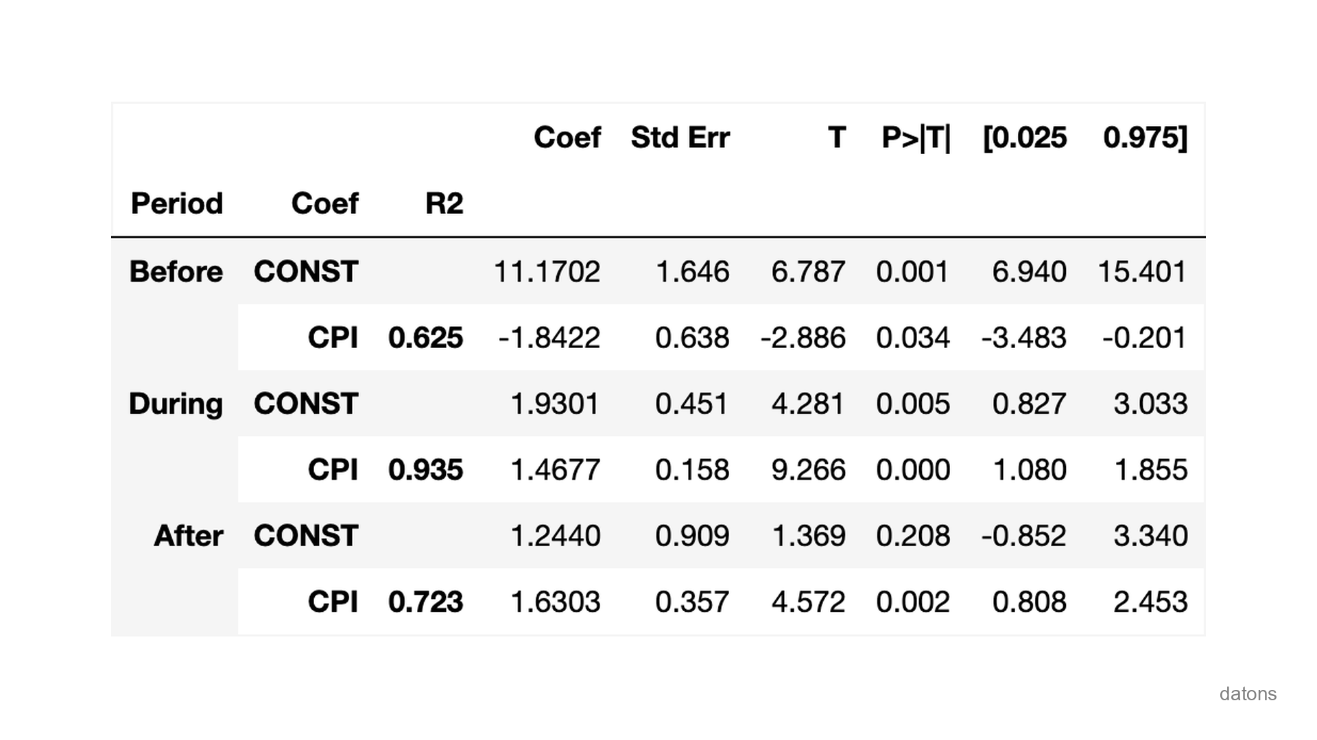
Conclusion
- Resampling the data from weeks to months improves the correlation analysis.
- Discretizing the data into periods improves the correlation analysis even more.
- The CPI and the MR are positively correlated, except for the period before the crisis.


