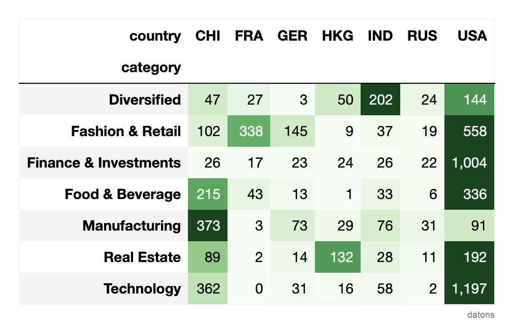
Even though Hong Kong is small compared to other countries, its billionaires in Real Estate have accumulated wealth amounting to 132 billion dollars.
They are only surpassed by the United States, which has 192 billion dollars in Real Estate.
How can we build such a heat matrix from a long-format dataset?
Data
Each row represents a billionaire, and the columns represent their attributes.
The dataset is a subset of the original billionaires dataset from Kaggle.
df = pd.read_csv('data.csv')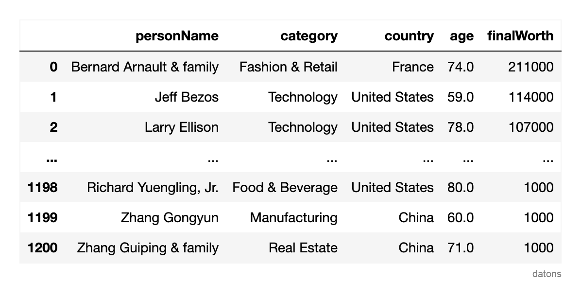
Questions
- What is a Pandas pivot table, and how is it used in data analysis?
- How can you summarize the total worth by country and category?
- How to style a
DataFrameto create a heat matrix? - Why is formatting a heat matrix crucial for optimal readability?
- What insights can be derived from analyzing the heat matrix?
Methodology
Pivot Table to Summarize Categories
To summarize the data into categories, we can use the
pivot_table function, setting its parameters as
follows:
index: the categorical column whose categories will be uniquely represented by the rows of the resulting table.columns: the categorical column whose categories will be uniquely represented by the columns of the resulting table.values: the numerical column upon which a mathematical operation will be applied.aggfunc: the mathematical operation to apply to the values.
Using our dataset, we apply the pivot_table function to
answer the following question: What is the total worth of billionaires
by country and category?
dfr = (df
 .pivot_table(
     index='category', columns='country',
     values='finalWorth', aggfunc='sum'
     )
)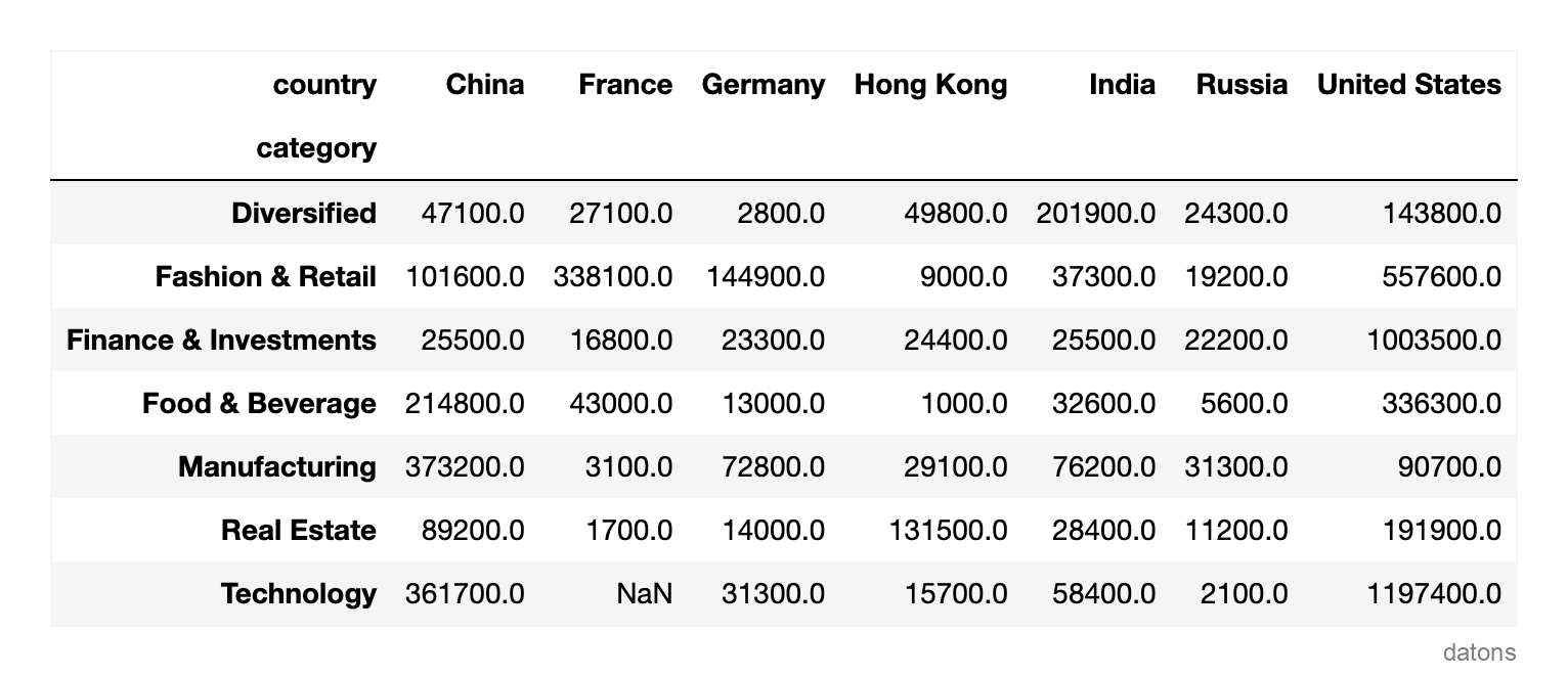
Having summarized the data, we can start to analyze it. However, the table does not visually highlight which countries have the highest total worth.
Let’s address this by coloring the table cells with a gradient color scale.
Heat Matrix with Background Gradient
dfr.style.background_gradient()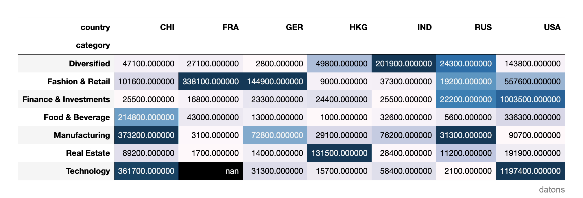
Hmm… now it highlights the cells with the highest values, but it’s very hard to discern the overall pattern.
Formatting the Heat Matrix for Optimal Readability
To make the heat matrix more appealing, we will:
- Fill missing values with 0.
- Divide the values by 1,000 to enhance readability.
- Format the numbers to include commas and omit decimal places.
- Reapply the gradient with the ‘Greens’ color scheme to symbolize dollar banknotes.
(dfr
 .fillna(0)
 .div(1_000)
 .style
     .format(precision=0, thousands=',')
     .background_gradient(cmap='Greens', axis=1)
)
Would this be interesting to one of your friends? Share it with them.
Most net worth is concentrated in the USA, although it’s remarkable how China’s manufacturers have accumulated wealth four times greater than that of the USA’s.
Which other insights can you spot? Share your thoughts in the comments!
Conclusions
- Pandas Pivot Table: Use
df.pivot_tableto summarize and analyze data patterns efficiently. - Summarizing Categories: Identify categorical variables for analysis and apply mathematical operations to numerical variables.
- Creating a Heat Matrix: Employ
df.style.background_gradientfor visual differentiation of values. - Optimal Formatting: Adjust units with
divand simplify numbers usingdf.style.format. - Deriving Insights: Analyze insights by comparing rows and columns against the color scale.
I’d love to hear your thoughts to further enhance our future articles.
What did you find most interesting or valuable in this piece?
Are there specific topics or aspects you’d like us to delve deeper into in our upcoming publications?
Your feedback is crucial for us to provide better content that aligns with your needs and interests.
Thank you for your attention and support!


